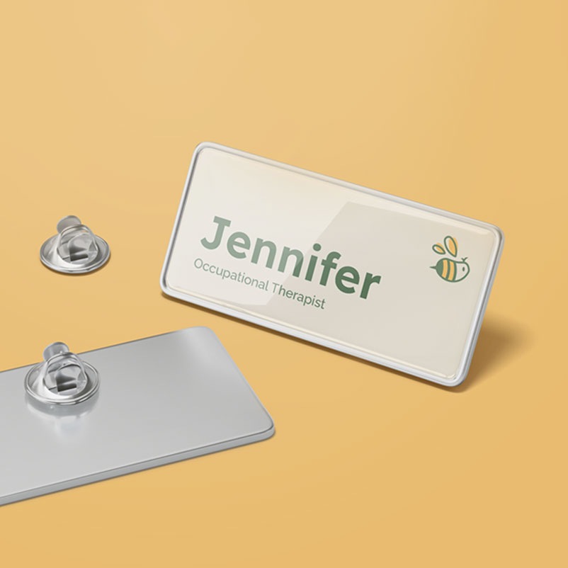
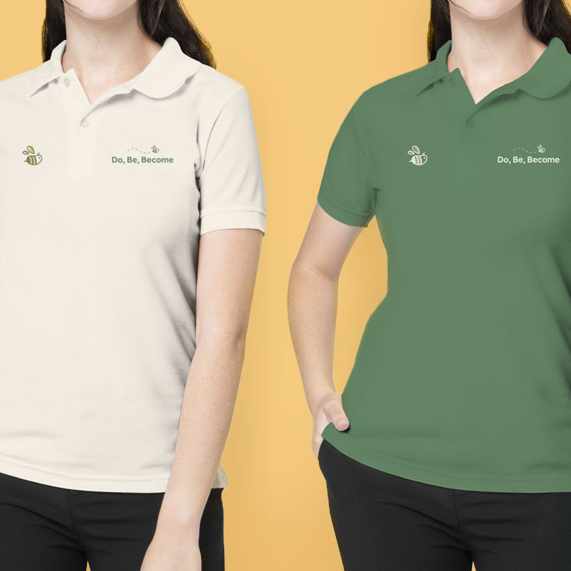
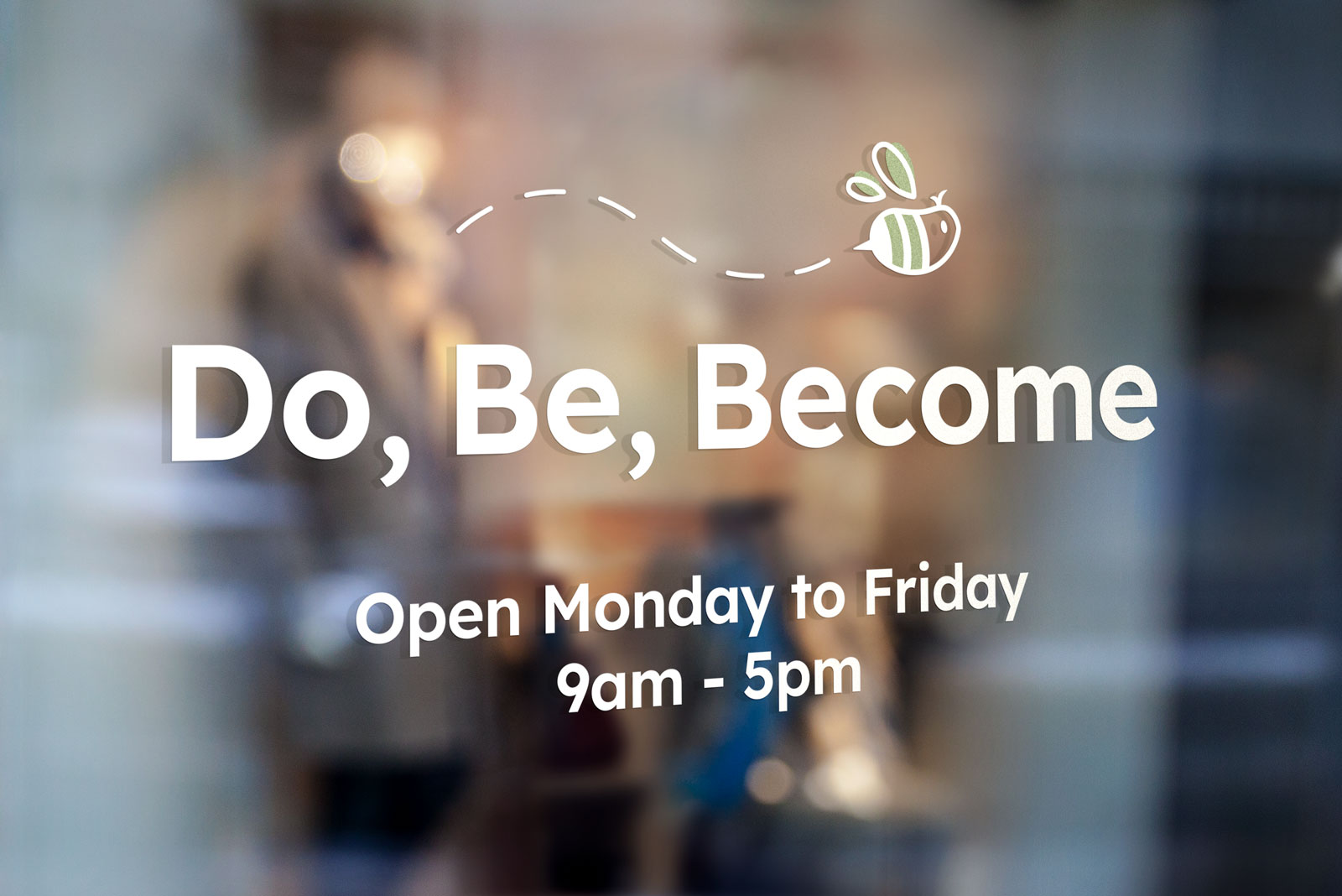
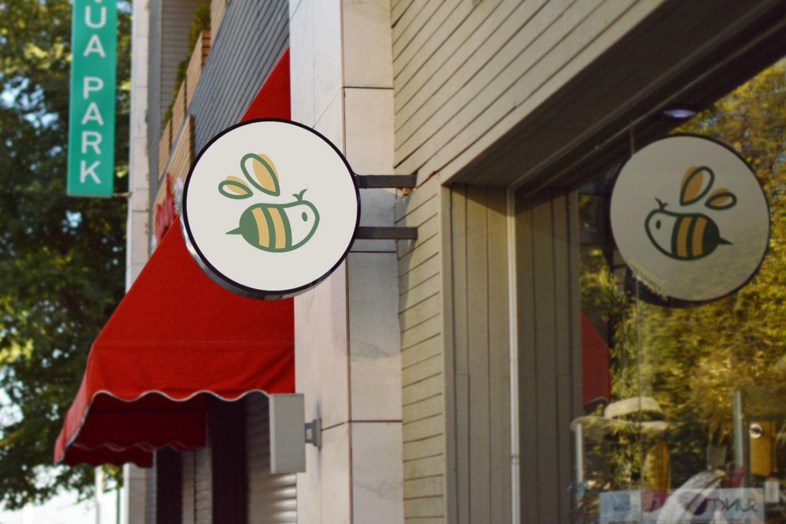
Do, Be, Become is an occupational therapy clinic based in South Gippsland, Bass Coast and Manningham that provides mobile and telehealth services to children and adults, assisting in managing intellectual, mental, physical conditions and meaningful day-to-day activities. Being a local and small business, it was important their branding continued to convey their holistic nature of work and present themselves as genuine and welcoming for local residents.
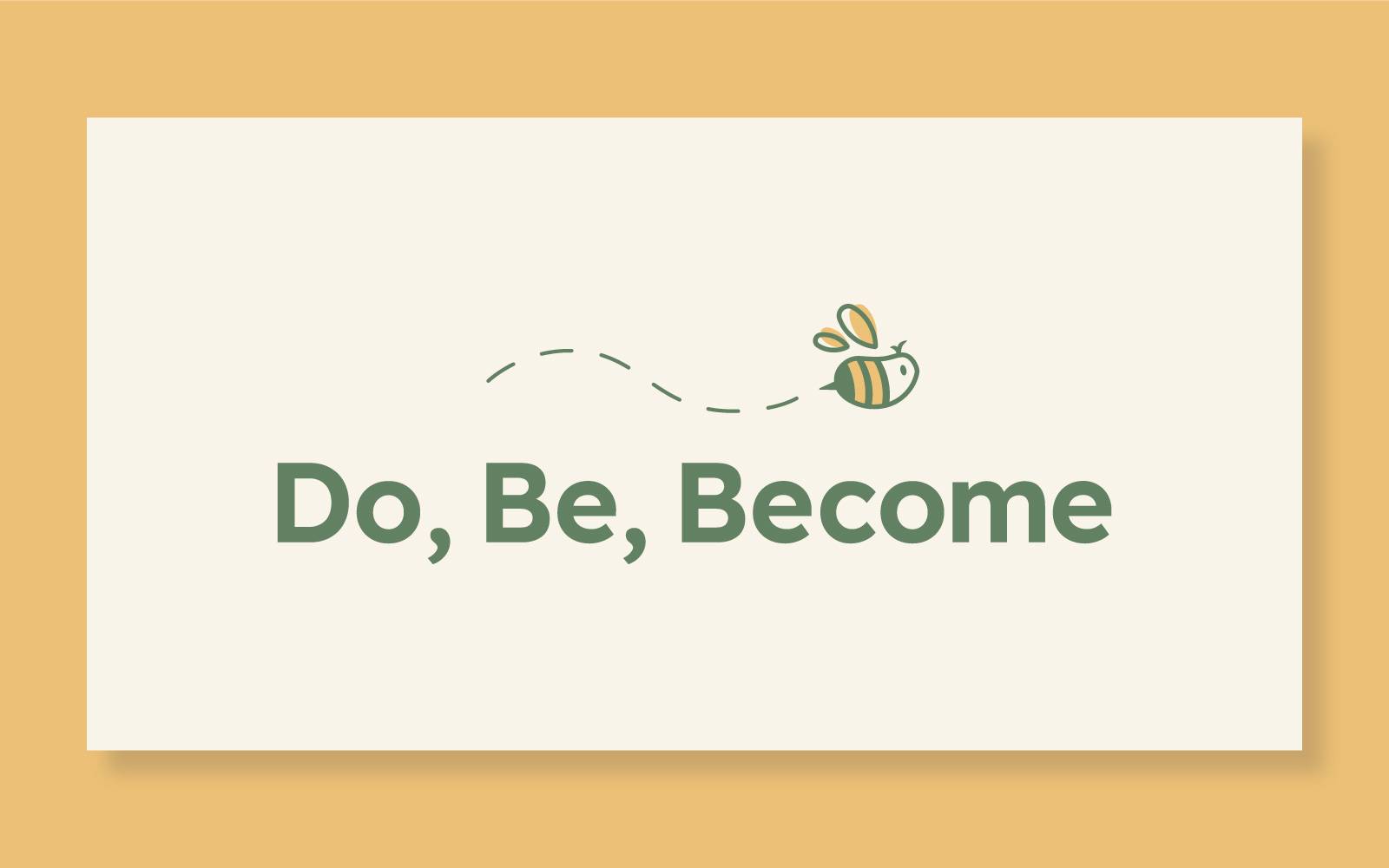
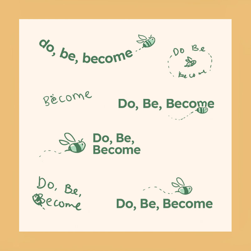
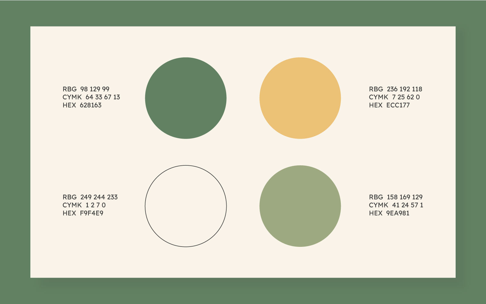
The bee imagery in the logo pays homage to the previous design and continues to symbolise the journey of growth; as well as life, co-operation and community - themes that align with Do, Be, Become's practice and values. Considering the rural locations of the clinic, the colour palette was inspired by the local environment, in particular the grassy plains, to appeal a sense of familiarity and calmness.
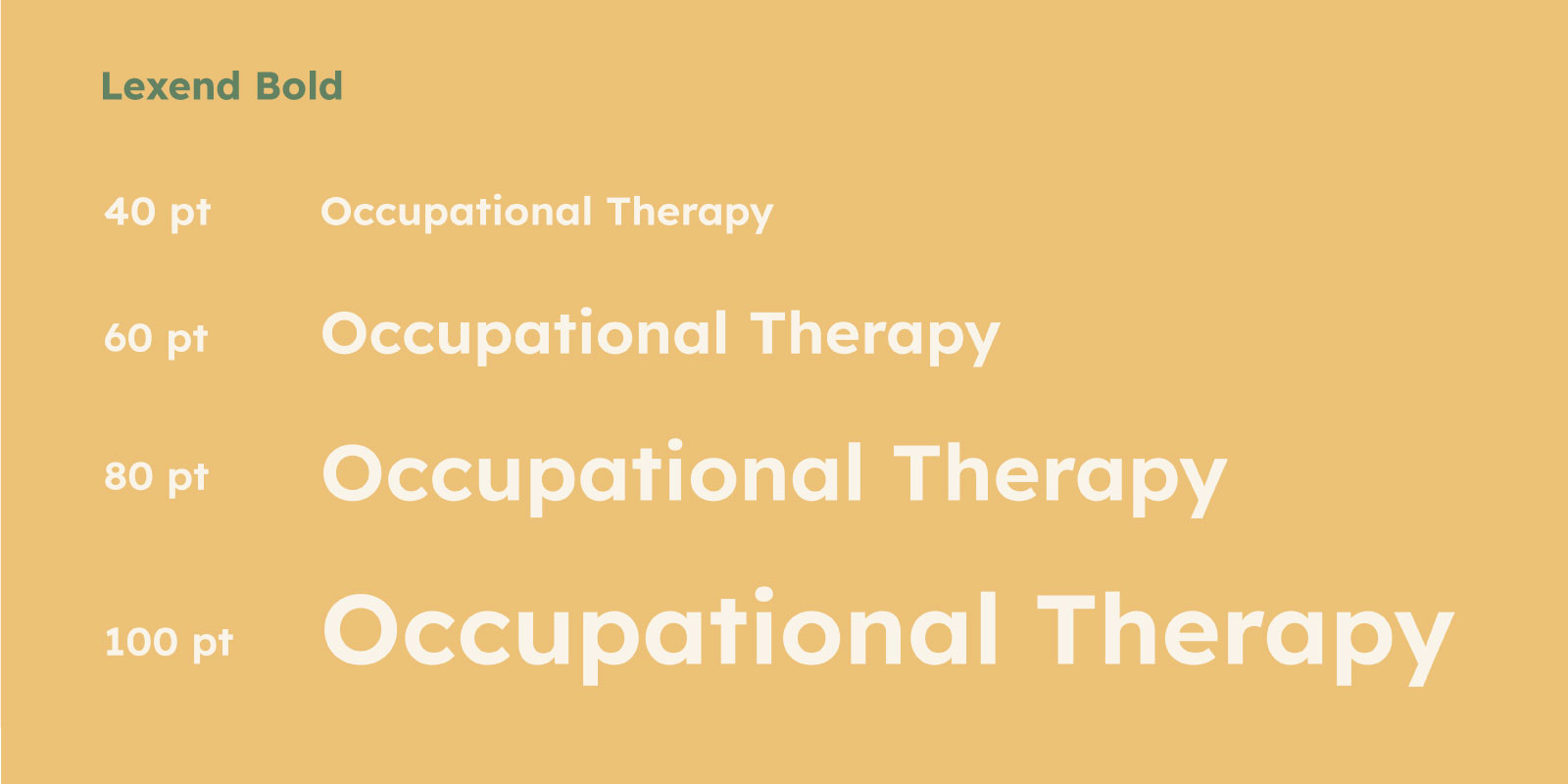
San serif typeface, Lexend, was used for its round, open qualities that come across as friendly and professional. Additionally, the typeface was designed to improve reading performance and reduce visual stress for all readers at any skill level - making it a suitable typeface for future clients, patients and professionals.
